Reimagining the Windows Phone 8 Homescreen
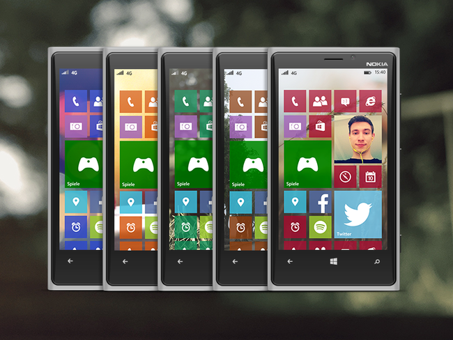
I’m now using Windows Phone exclusively for the last year and semi-exclusive for one and a half years. Slowly but surely the general typography-heavy design of windows phone gets a little antiquated. I think it is time for Microsoft to bring more customization options to its mobile OS. For example to choose a custom background image for the homescreen.

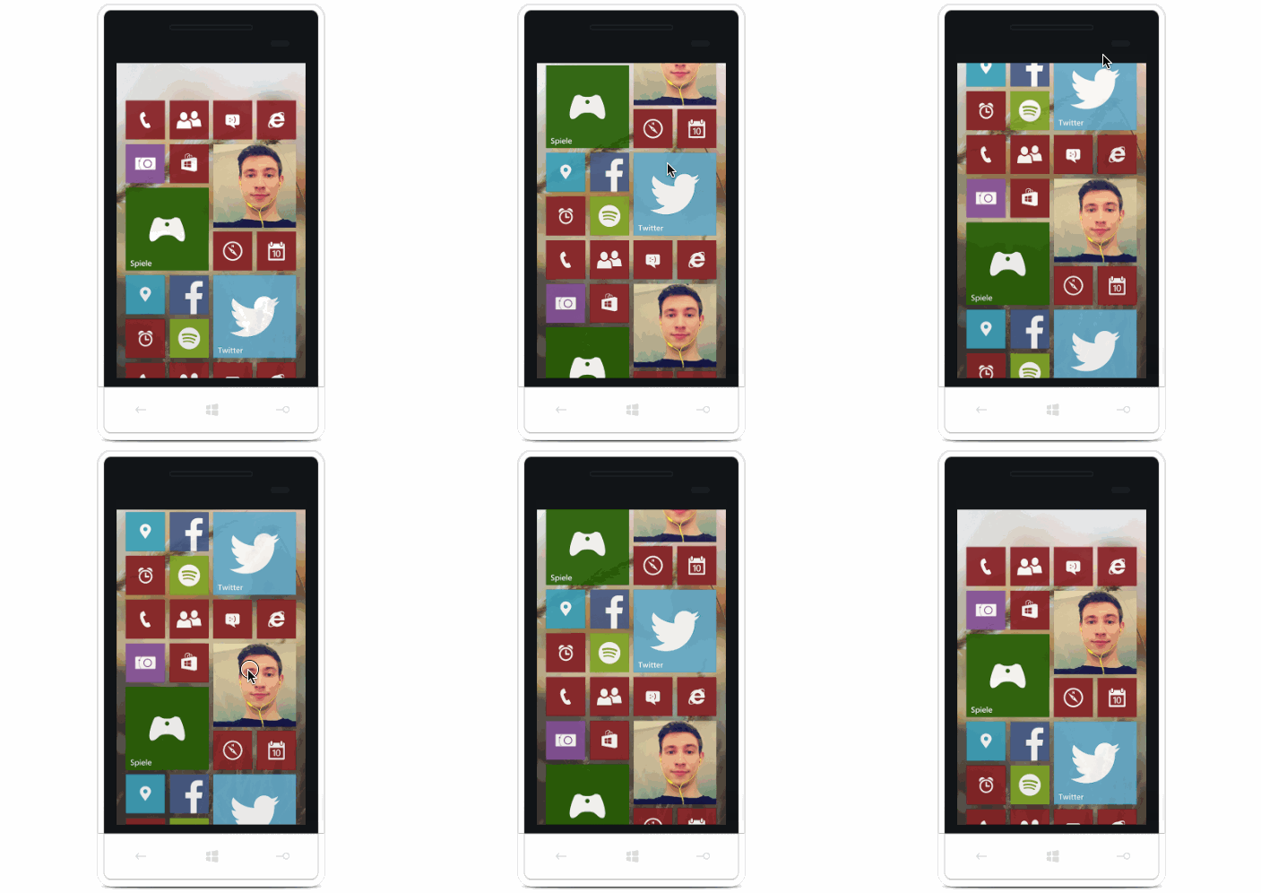
Here’s a mockup (see: video) of how I would imagine this new homescreen. Tiles will be semi-translucent. Also there is a parallax effect so the background scrolls with the live-tiles.

A swipe to the right and you’ll get the complete list of apps. Nothing new here.

When swiping to the left, the new notification center appears. With a nice blurry and darker background to make the text better readable.

What do you think? Have you something to add? Send me a tweet. Also check out the video version of this mockup.